How to Improve Conversion Rates with Smarter Experiments | RemotionAI Blog
conversion rates · CRO playbook · A/B testing · landing page optimization · AI video ads
Learn how to improve conversion rates with a proven CRO playbook covering goals, funnel diagnosis, A/B testing, and creative tactics that actually move
A landing page with a 6.6% median conversion rate is performing around the cross-industry middle, while the top 25% reach about 11.45% or higher, according to landing-page conversion benchmarks from Colorlib. That gap doesn't mean every team should chase one universal target. It means the practical question is how to move a relevant page toward the stronger performance of its category without damaging revenue quality, retention, or support capacity.
The mistake is treating conversion rate optimization, or CRO, as a pile of button-color ideas. The teams that improve conversion rates consistently treat CRO as triage. They find the most expensive leak, score the available experiments, validate one meaningful change, and feed the learning back into the next decision. Video-first creative can then bring better-matched visitors into a funnel that already works, instead of masking a broken checkout with more traffic.
What Conversion Rates Should Actually Optimize For
A conversion rate is useful only when it connects to business value. A 6.6% landing-page conversion rate means roughly one visitor in fifteen converts, while 10% or more is generally considered strong in many landing-page contexts, according to Colorlib's benchmark overview. Category differences remain substantial: the cited medians include 9.8% for catering and restaurants, 7.9% for media and entertainment, 6.2% for finance and insurance, and 5.8% for education.
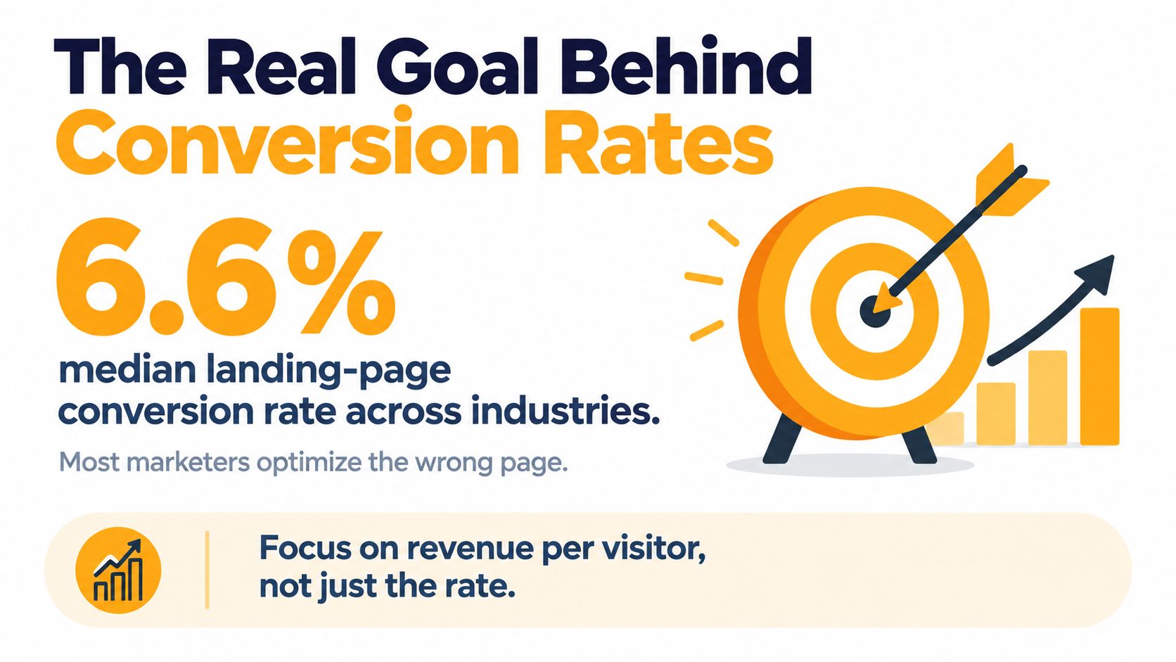
The stronger operating target is revenue per visitor, supported by a conversion rate that does not create expensive refunds, poor-fit leads, or avoidable support work. A page can generate more sign-ups while hurting the business if those users never activate or purchase. A modest lift from a well-qualified segment may therefore matter more than a large percentage increase from low-intent traffic.
Score the leak, not the loudest idea
Begin with the funnel step costing the most revenue. If traffic is healthy but visitors abandon after adding a product to the cart, rewriting the hero section is probably a distraction. If qualified visitors reach the landing page but the form blocks completion, shorten that path before testing another headline.
Use Tagada's conversion rate guide for additional ecommerce context, then rank observations instead of building an endless checklist. A score based on impact, confidence, and ease helps a team spend limited testing capacity on changes with a plausible business payoff. ICE or PIE scoring makes the trade-off explicit: a high-impact idea with weak evidence may deserve research before implementation, while an easy tweak with little upside should wait.
For acquisition teams using video, what video marketing means for modern campaigns matters because creative quality affects who enters the funnel. Video-first ads, including AI-generated video, can improve message fit, but they cannot repair a checkout that surprises buyers or a form that asks for unnecessary information. Validate the funnel first, then scale the creative that brings qualified demand.
Practical rule: Optimize the most expensive leak first, not the page your team happens to be discussing.
Set Conversion Goals and KPIs You Can Actually Measure
A conversion goal should name one event, one business outcome, and one deadline. “Improve the website” gives a team nothing precise to test. “Increase completed purchases from qualified paid-social visitors during the quarter while keeping refunds and support contacts within acceptable limits” defines both the target and the guardrails.
Use the 6.6% cross-industry landing-page median as orientation, not a promise, and set a realistic category-level target with Colorlib's benchmark data. A useful goal is specific, measurable, achievable, relevant to revenue, and time-bounded. It should also reflect the funnel problem you are prioritizing, rather than reward activity on a high-traffic page.
Choose one primary KPI
Select the conversion that matters most at the current stage. Pair it with a counter KPI so a local improvement does not create downstream damage.
| Primary KPI | Counter KPI |
|---|---|
| Completed purchase | Refund rate |
| Qualified lead | Sales acceptance rate |
| Activated account | Support tickets |
| Completed checkout | Payment failure rate |
| Product upgrade | Early cancellation |
Before launching an experiment, confirm that analytics records a clean event sequence such as view_item, add_to_cart, begin_checkout, and purchase. Deduplicate user IDs, keep attribution logic consistent across platforms, and apply the same UTM conventions. Otherwise, a promising segment may reflect tracking differences rather than buyer behavior.
A dashboard is not ready for decision-making if two marketers report materially different answers from the same data. As a practical check, they should agree on the conversion rate to within a tenth of a percentage point. If they cannot, resolve event definitions, attribution windows, exclusions, or identity stitching before evaluating a result.
Put the primary KPI and counter metrics in the test brief. A higher conversion rate is not a win if it comes from misleading claims, unqualified leads, increased refunds, or a checkout change that causes more payment failures. The metric hierarchy keeps experiment selection tied to business value, while ICE or PIE can determine which credible opportunity deserves testing capacity first.
Diagnose the Funnel Before You Change Anything
Most wasted CRO work starts one step too late. A marketer sees a weak click-through rate, changes the headline, and misses that the actual problem appears after the visitor has already shown buying intent.
Map the journey as discrete events:
- Impression to view, which shows whether the creative and placement earn attention.
- View to click, which reflects message relevance and call-to-action clarity.
- Click to add to cart or lead start, which exposes offer and page friction.
- Add to cart to begin checkout, which often reveals cost, trust, or payment concerns.
- Begin checkout to purchase, which isolates completion problems.
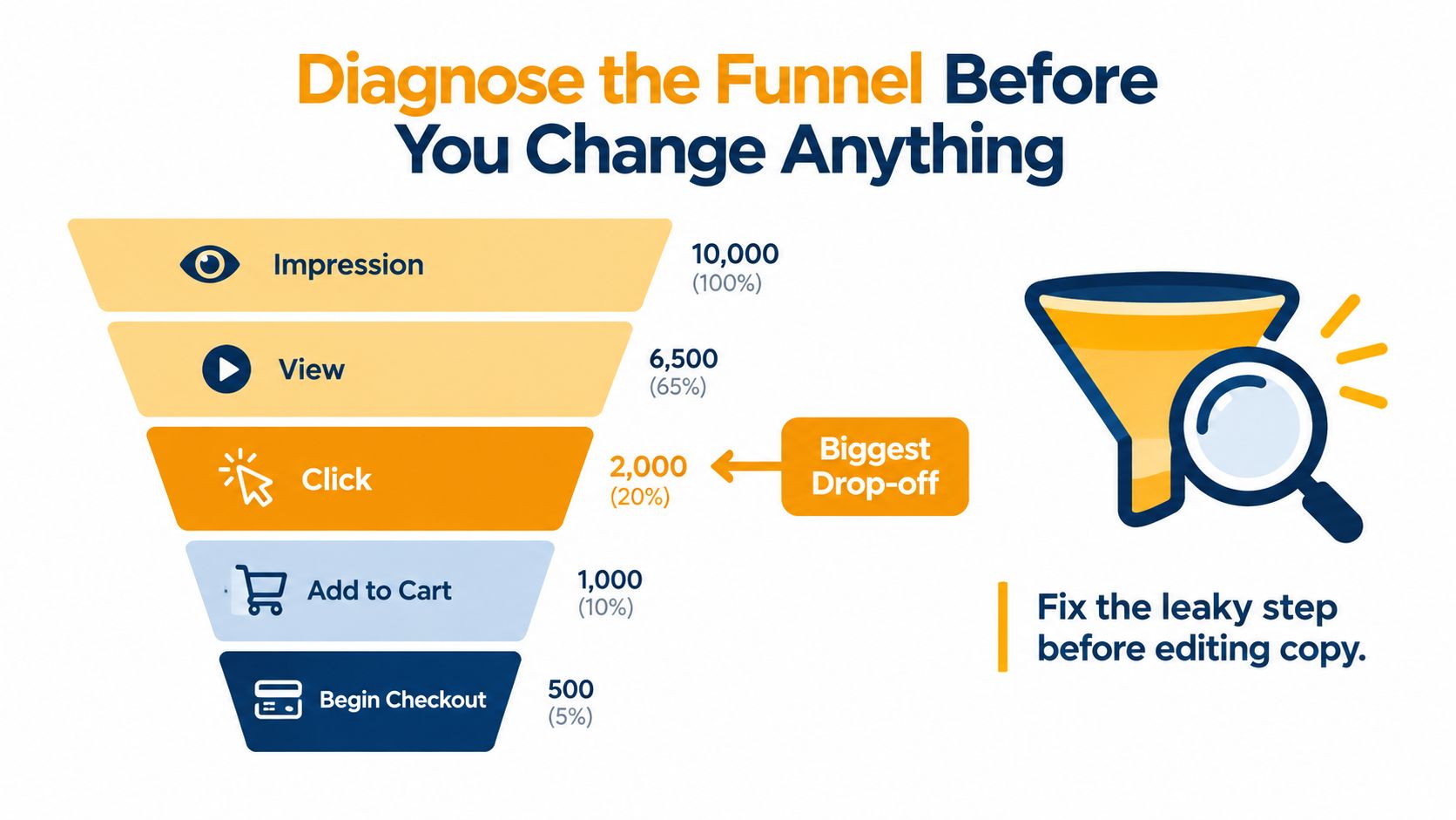
Measure both absolute losses and the relative drop between adjacent stages. Then segment by device, traffic source, landing page, and new versus returning users. Aggregate data hides expensive differences. Mobile visitors may struggle with fields and payment selection, while paid social visitors may misunderstand the offer before they ever reach checkout.
Find the largest gap against a relevant baseline
A useful diagnosis compares each stage with its own expected performance, not with a site-wide average. Dedicated landing pages average 6.6% conversion, compared with 0.6% for embedded sign-up boxes, and three-field forms average 10.1%, compared with 3.6% for nine-field forms, according to landing-page optimization benchmarks from GTM 8020.
Consider a page where the hero attracts clicks and visitors add products to their carts, but 70% of the observed leakage occurs between add-to-cart and begin-checkout. The obvious instinct is to fix the hero. The evidence points elsewhere, perhaps to an unexpected shipping cost, unclear delivery timing, or a payment option that disappears on mobile. The right experiment makes that uncertainty visible and removes it.
Hypothesis Generation and ICE Prioritization
A test idea should be falsifiable. “Make the page more persuasive” can't tell a designer what to change or an analyst what result would support the idea.
Use this format:
Because [diagnostic finding], changing [element] for [audience] will improve [metric] because [mechanism].
For example, if mobile users abandon at checkout after shipping appears, the hypothesis might be: because mobile shoppers see delivery cost late, showing the full delivered price before checkout will improve completed purchases because it removes an unexpected decision barrier.
Score ideas before they enter the sprint
ICE gives each idea a score from 0 to 10 for Impact, Confidence, and Ease. Add the three values. A 24 out of 30 idea belongs ahead of a 12 out of 30 idea when the evidence and implementation cost support that ranking.
PIE offers a different lens:
| Criterion | ICE | PIE |
|---|---|---|
| Impact or potential | Plausible size of the lift | Potential based on page traffic |
| Evidence | Confidence in the diagnosis | Importance of the page in the funnel |
| Delivery | Ease of shipping | Ease or engineering cost |
| Best use | Analytics-backed decisions | Portfolio-level page triage |
Use ICE when you understand the failure mechanism. Use PIE when several pages compete for attention and the available data is uneven. Don't stack multiple unrelated changes into one test. Predict the direction and size of the result in the ticket, then review whether that prediction was realistic.
A disciplined team ships fewer, better experiments. Six well-supported ideas scoring above 20 can teach more than forty cosmetic tweaks. A documented video feedback loop can help creative and growth teams turn observations into clearer hypotheses rather than subjective revision cycles.
A/B Testing Without False Wins
A/B testing fails most often because teams launch tests without defining what would count as a meaningful result. Set the minimum detectable effect, required sample size, planned runtime, allocation, and decision rule before traffic arrives.
The methodology matters because a 2026 dataset of 2,408 A/B tests found that only 17.4% reached statistical significance with a winning variant, while 74.2% were inconclusive and 8.4% identified a significant loser, according to Webtonic's A/B testing statistics. An inconclusive result isn't wasted if the test was designed properly. It tells you the change didn't produce a detectable effect at the chosen threshold.
For a baseline conversion rate of 3%, detecting a 5% minimum detectable effect at 95% confidence with 80% power required a median of 14,800 sessions per variation in that dataset. The sample requirement changes with baseline, traffic, allocation, and the effect you want to detect.
Protect the experiment from operational errors
- Stop peeking: Don't call a winner because the dashboard looks favorable early.
- Check allocation: A planned 50/50 split that delivers 47/53 may indicate a sample-ratio mismatch.
- Randomize consistently: Keep users or sessions in the same variant instead of switching them by pageview.
- Define the outcome: At the planned sample size, classify the result as winner, loser, or iteration.
- Inspect segments carefully: Use device and source splits to explain behavior, not to hunt for a flattering subgroup.
Speed can distort the test before the first variant is evaluated. Pages loading in one second achieved three times the conversion rate of pages taking five seconds in Google-cited historical data summarized by Involve.me. Fix severe performance problems before interpreting a creative or copy test.
Landing Pages, Checkout, and Video-First Creative
The page changes with the biggest impact are often unglamorous. Match each ad to a dedicated landing page with the same promise, remove form fields nobody uses, expose total costs early, and make the primary action obvious on a small screen.
Dedicated pages average 6.6% conversion, while embedded sign-up boxes average 0.6%, and three-field forms average 10.1%, compared with 3.6% for nine-field forms, according to GTM 8020's landing-page data. The same source reports that each one-second delay beyond 2.5 seconds in Largest Contentful Paint cuts conversions by 7% across 2.1 million sessions. Those structural penalties can overwhelm a clever headline test.
Remove device-specific friction
Mobile conversion isn't solved by shrinking a desktop layout. Check whether customers can use one-tap wallets, autofill, guest checkout, persistent carts, readable delivery information, and error messages that remain visible after the keyboard opens. Shopify's analysis associates each 100 milliseconds of slower load time with about 3.5% lower conversion rates, while its summary cites pages over four seconds as having 22% lower conversion rates in Yottaa's 2025 ecommerce dataset, as reported in Shopify's load-time analysis.
Treat acquisition creative and the page as one system. Short UGC-style demonstrations, product clips, and clear problem-first hooks can qualify attention before the click. Tools such as RemotionAI can turn plain-language concepts into platform-ready videos with AI voiceovers, captions, brand controls, and vertical or horizontal formats, allowing teams to produce and compare creative variations without booking a shoot.
Test one new video angle against the current control while holding the landing page constant. Once the traffic quality and click behavior establish a new baseline, test the page. Guidance on how to create video ads can help teams structure hooks, demonstrations, and calls to action. For checkout-specific diagnostics, Otter A/B's guide to fixing checkout friction offers a useful companion resource.
Your 30-Day CRO Reporting Rhythm
CRO compounds when every test leaves behind a decision, a measurement rule, and a sharper next hypothesis. A monthly rhythm keeps the team from restarting with a new list of ideas every Monday.
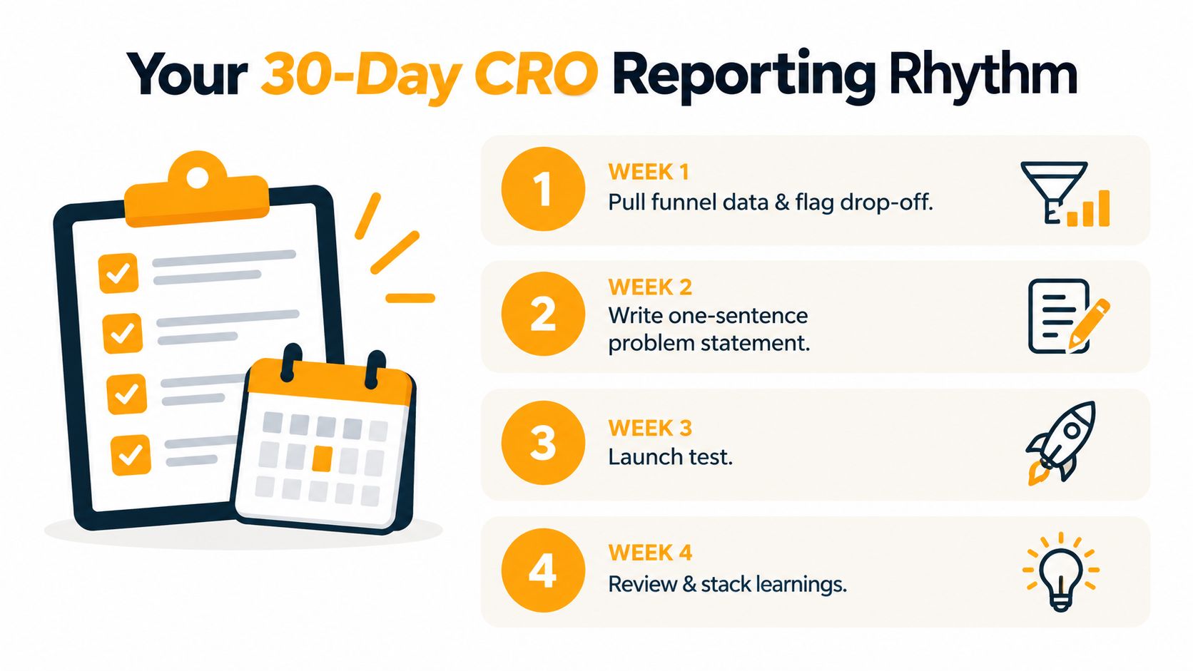
Use four weeks to build evidence
Week 1: Pull funnel data, identify the largest week-over-week drop-off, segment it by device and source, and write a one-sentence problem statement.
Week 2: Generate three hypotheses, score them with ICE, select one, and document the primary KPI, counter metrics, minimum detectable effect, sample target, and runtime.
Week 3: Check sample allocation, tracking quality, novelty effects, and meaningful segment differences. Don't declare victory because one slice looks positive.
Week 4: Write a one-page memo covering the result, primary KPI movement, counter-metric movement, implementation decision, and the next test revealed by the evidence.
Keep a scorecard with test velocity, win rate, average lift, and revenue per visitor. These metrics describe the health of the program, but they shouldn't replace the funnel diagnosis. A low win rate may reflect ambitious tests, while a high win rate may indicate that the team only ships obvious changes.
Use this Monday checklist in under 90 minutes:
- Validate tracking: Confirm event counts and attribution.
- Find the leak: Mark the largest stage-level drop.
- Review segments: Check device, source, and audience differences.
- Score ideas: Rank the next three hypotheses.
- Confirm readiness: Set the sample target and decision rule.
- Record learning: Close the prior test with a written decision.
The goal isn't to chase a perfect conversion rate. It's to create a reliable loop that finds friction, tests a plausible fix, and improves the economics of qualified traffic.
RemotionAI helps marketers turn plain-language concepts into production-ready videos for social ads, product launches, ecommerce campaigns, and explainers, with voiceovers, captions, brand controls, and platform-ready formats. Use RemotionAI to produce the next set of video variations, connect each creative to a measured funnel hypothesis, and start your next CRO sprint with evidence rather than guesswork.